Education Site Redesign Project
Case Study
UX Design | Information Architecture |Usability Testing | Project Management|

Summary
Client
Beginex, a UX training and mentorship program.
Team
Ariella Chivil & Krizia Fernando
Goal
To establish credibility in the UX training market and drive sign-ups for the Fall 2017 cohort
Role
I acted as the UX Research lead, constructing a user research and testing script, running sessions, and synthesizing initial findings. I also created sketches and wireframes, drafted a content strategy, wrote web copy, and worked with Krizia to implement the preliminary build in Strikingly site builder.
Constraints
Designs needed to be implemented in an affordable/easy-to-update sitebuilder and so
had to respect the limitations and flexibility of the CMS
Time sensitivity: design needed to be implemented quickly, in time for upcoming cohort
Sustainability: We would be handing off the site to the stakeholder for long-term use. Layout and content needed to be easily updated by the key stakeholder.
Lean approach. Since we were handing off the design to the stakeholder, an early-stage startup, we had to incorporate the business need of an affordable, easily-updated site design and CMS
Process
Foundational Research
Business Modeling
Competitive Analysis
User Research and Synthesis
Sketching
User Flows
Information Architecture
Wireframes
Prototyping and User Testing
Implementation
Implemented feedback from user testing into the Strikingly site builder
1. Design Research
Competitive Analysis
We analyzed the website(s) and value propositions of dozens of UX training programs across the US to and applied these insights to identify potential differentiators, opportunities, and threats. We then incorporated these insights into our sketches, our assumptions, and our user flows.
Assumption mapping
We had some key assumptions we wanted to identify prior to setting up the tests, these included:
Users wanted to learn about the founder
Name brands / companies are powerful
Career switchers are budget conscious and are highly sensitive to price
Users wanted in-depth information about the course prior to reaching out for more information
Job search support is a valued feature
2. User Research and Synthesis
We then worked with the stakeholder to recruit users in our target market, beginner UX designers and career-switchers.
Sketching
Initial user research guided our preliminary sketches.
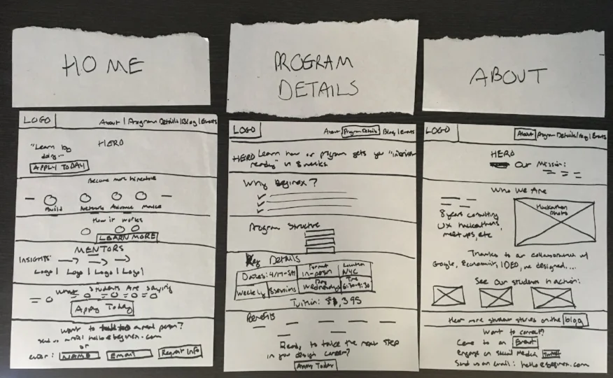
3. Wireframing
We presented our sketches to our stakeholder, incorporated feedback, and began constructing hi-fidelity wireframes to inform our build. Prior to finalizing our wireframes, we tinkered with a test account on Strikingly to ensure our designs could be implemented successfully given the constraints of the sitebuilder.


Because we wanted to test not only the UI, but also the value prop and content strategy, incorporating the content into the design early was important.
So, we wrote a content strategy and wrote copy for the top four pages to start testing.
We then presented our wireframes and content strategy to the client, iterated the designs based on the feedback, and prepared for testing.
4. Prototyping & User Testing
We took a slightly unconventional approach to prototyping for this project, given the urgent business need to update the website in time to recruit for the upcoming cohort. So, in discussion with our stakeholder, we decided to build our wireframes directly into the Strikingly site builder. This was done to:
confirm the feasibility of our designs given the site builder’s limitations
ensure the test UI would match the actual build once implemented
Decrease the turnaround time from incorporating the feedback from user testing to implementing the live site.
Hypotheses
One of the key areas we wanted to identify was how intuitive the navigation bar was, did it help users find the information they needed as quickly as possible?
What is a good prioritization or ordering of the navigation bar IA?
Is the information whether they expected it to be?
Was any language about the course vague or confusing?
Another test: is a high touch experience, with limited information on the landing page to encourage them to reach out an effective strategy, or would it be more effective to provide the course information upfront? This with managing the business need of protecting trade secrets.
Usability Testing
I conducted sessions remotely using GoToMeeting screen share and recorded the findings. Documentation was completed ahd shared immediately post-session, with key highlights presented to the stakeholder once all sessions were completed.
Insights
Users looking for a UX training program are price conscious and savvy consumers
Price sensitivity findings:
They need to be convinced that there will be a strong ROI for any program they consider
In both the short term (acquiring skills, getting a job) and long term (success in a UX role, growth)
Users may pay for multiple bootcamp-like programs until they feel confident enough and/or acquire a UX job
Bootcamps focused primarily on theory and/or technical skills were not always sufficient
Users might take out a loan or dive into their savings in order to pay for courses, making them even more sensitive to price
Savvy consumer findings:
While seeing name brands of companies on the site intrigued them, they wanted more insight into the instructor's role and expertise
Users wanted to learn more about the exact methodologies, frameworks, and coursework they should expect before signing up
As most of the projects were centered around group, users wanted to learn more about the caliber of students admitted into the program
Users wanted to evaluate the value of a given project to their overall portfolio prior to conversion
Usability findings:
Users expected either a multi-page navigation, or a single-page navigation - not both. We modified our information architecture to reflect this.
5. Implementation
We built an MVP version of the site into Strikingly. Final version can be found here: beginex.com.
Learnings
Potential users wanted to learn more about the caliber of the students they would be working on teams with
They wanted more insight into the ROI of the program - not only in the short term (acquiring skills, acquiring a job) but also long term (how will this help me perform in a UX Design role?)
Reputation is important, and for a new program with limited social capital, capitalizing on the reputation of the founder, the mentors, the companies, and the methodologies is important.
Conducting more in-depth user research would be helpful to refine target users and personas before recruiting for user tests.
Separating market research from user research is crucial to gaining as objective as result as possible.
As a user of the service and a designer of the prototype, it can be challenging to separate a desire to succeed with the need for objective research.
Managing the stakeholder relationship to ensure the integrity of the research is important.
Asking questions like "would you buy this?" or "Would you sign up?" -- while helpful to the stakeholder -- can impact the overall findings and the interaction with the participants.